YING GALLERY RENOVATION 2016 | Praxis d'Architecture
YING GALLERY RENOVATION 2016
- Completed
- 04/01/17
Description
Site: Cao Chang Di, Beijing
Time: 2016
Status: Completed
Size: 100 sqm
Project Architect: Di Shaohua
Team: An Zhaoxue, Feng Shuxian, Liu Xing, Feng Jiancheng
Photographer: Xia Zhi, Feng Shuxian
Existing Condition
Ying Galley’s new location is inside a yard surrounded by two story buildings. Between the yard wall and the buildings there is a an ally 28m in length and 3-3.6m in width. The ally was for outside maintenance, but in order to yield more rental spaces, the landlord added a roof to it and closed it with a door at each end. Such is the existing condition of the site.
Cao Chang Di is an art zone not far away from 798 art factory. While 798 is becoming more and more commercialized, Cao Chang Di is still accommodating a considerable number of artist studios. A mixture of studios, galleries, shops and restaurants is settled in a combined texture of masonry buildings and light steel glass additions.
The lease of the space is for five years. For a gallery that is small and relatively new, it is considered long enough. The art district located at city periphery such as Cao Chang Di is under constant transformation as a result of fast paced Chinese urbanization. Many small galleries and studios have to change their spaces every three to five years due to rental increase or demolition of the spaces when land use policy changes. The gallery owner expected the 100 square meter renovation to be durable up to five years, thus limited the construction cost to be around 1000 RMB per square meter. The design of Ying gallery renovation started under such conditions.
Design
The design intended to make a place where art and people interact, a bridge that links art and life. Instead of remaining inside the yard, the gallery volume was brought out to the street. Since the yard wall must be kept intact, we sandwiched it with interior fit out and an exterior layer of poly-carbonate panels. The poly-carbonate panel is lightweight and economical. To increase its durability and achieve the desired visual quality, a layer of reflective membrane was applied to it at the back, giving the surface a metallic look in distance. The same panel continues into other exterior surfaces of the gallery inside the yard, so that a new volume grows out of the existing physical context yet also forms contrast to it.
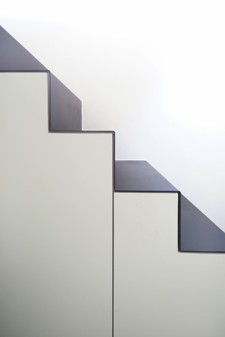
Currently there are strict regulations from local authority in such area regarding adding height and addition to existing structures. After lots of negotiation, a 5m long section of the roof was permitted to raise by 1.5m, which determined the spatial layout of the gallery. The exhibition space consists four show rooms, three on the main floor at 3.6m high and one on the mezzanine at 2.3m high. Underneath the mezzanine the exhibition space narrows into 1m wide and 2.4m high to accommodate a few niches on the wall, which draws people’s attention to small items to be displayed in it. Right beside, a bathroom, a kitchen, a storage and a stair are integrated into a compacted functional zone.
There is a full height window facing the street on the mezzanine level. The window here is an invisible bridge, linking the street and the exhibition space and providing a corner for contemplation. The window also brings natural light into the functional zone underneath.
As the most private space, the bathroom is applied to its wall with the same poly-carbonate panel as that of the exterior wall to blur the boundary between inside and outside. The DIY ceiling lamp is composed of more than 30 “flowers”made from non woven fabrics, filtering blue or red light into the space. The “flower lamp” recalls flower in nature. The design intended Ying galley to be like a flower, temporary and transient as it would be, however, to exude freshness and energy , in hope of contributing to a better surrounding.


